
Thursday, 7 May 2015

Wednesday, 6 May 2015
Music Magazine- Pitch
By researching music
magazines which are associated to the music genre I chose to base my music
magazine on, I noticed that the codes and conventions are very similar if not
identical. A similarity that the magazines I looked at had was that they have
the same target audience. Through knowing this I applied it to my magazine to
make my magazine stand out from other magazines by:
-My music magazine will
cost £2.99 as I felt like that is an affordable price for my target audience
and for the quality of my magazine, by price my magazine at £2.99 I feel like
my magazine will be successful and I will generate a profit.
-As my magazine is £2.99
I will regulate my product on a monthly basis in order to ensure that my
magazine is of a high quality. Also my magazine will be available online for
anyone that missed an issue.
-In order to take my
pictures I used a professional camera to achieve the best quality photographs
possible. I did this so that my front cover, content page and double page
spread looked professional and of a high quality.
-To differentiate my
music magazine from other magazines available, I used a unique selling point
which is winning tickets to ‘V-Fest’! As a result of this I aim to attract more
customers as the festival has a large following.
-I used puffs and cover
lines on the front cover of my magazine to draw people attention towards my
magazine.
Conventions Of A Music Magazine
In order to create a guide to stick to when I
constructed my music magazine, I researched the conventions of a music magazine
then made a list of the conventions that the front cover, content page and
double page spread consist of.
Front Cover:
-Barcode on the bottom of the page
-The price of the magazine
-Consists of selling lines and puffs
-A mast head that is memorable and stands out
-Large main image (typically an MCU shot)
-Date and issue number
Content Page:
-Features, divided into categories
-Page numbers next to the topic
-Bold title at the top of the page
-A large image
-Consistent colour scheme
Double Page Spread:
-Large image that takes up a page (mode of address)
-A quote from the person the magazine interviewed
-Simple, professional and elegant font
-Drop capital
-Context placed into columns
Wednesday, 29 April 2015
Music Magazine- Evaluation
1) In what ways does your media product use, develop or challenge forms and
conventions of real media products?
My main task for my Media Studies, I designed
an R&B music magazine which was names ‘INSiGHT’. My magazine’s target
audience was for teenagers to young adults, who enjoy fashion, the best
selling albums of 2015, upcoming singles and many more things. In order
to ensure that my music magazine has as much success as magazines like
Billboard have, I followed the conventions of popular and successful music
magazines. In the process of completing my music magazine, I annotated 4
magazines, 2 of which related to the music genre my magazine was and 2 which do
not. I did this as they influenced me on how to layout my magazine, what fonts
and images to use and what kind of content would be most suitable for my music
magazine as a result of this it helped me to successful complete my final
piece.
The front cover of my magazine had ‘INSiGHT’ at the top in bold and large
letters; I placed at the top to follow the conventions. I followed this
convention so I could successfully grab the attention of my readers. In
order to create a meaning that my readers will understand when they first
look at my magazine, I named my magazine ‘INSiGHT’ as my magazine lets my
readers look into celebrity’s lives and the latest and best recent music. As
the main image of a music magazine is the selling point for most magazines, the
photo has to be of a high quality. Sticking to the conventions of a music
magazine I placed my main image dead in the middle of my front cover, my main
image had texts and cover lines all around it. By doing this the readers had an
understanding of what my magazine consisted of.
Many magazines inspired me as their main image related to their genre of
magazine. As the genre of magazine I chose was R&B Vibe and Billboard
inspired me the most, using there magazines as inspiration I realised that most
of the main images show the typical ‘celebrity’ look. On the front cover the
female artists/ models are posted in a provocative way, usually they are
wearing revealing clothing which is the latest fashion. By doing this it
entices readers to read the magazine as they aim to style or look like the
celebrity on the front cover.
To attract existing and new customers, I included a selling line on the top of
my magazine which read ‘Win Free Tickets To V-Fest!’ I did this to attract
customers as a lot of people who listen to different genres of music attend
V-Fest every year. Another magazine convention is a bar code that is placed at
the bottom corner, I did this so that the customers notice the more import
things such as the main image and cover lines and not the bar code.
For my content page I followed the codes and conventions of the content pages
of magazines like Vibe and Billboard. By researching the content pages of music
magazines I realised that they have one main image with page numbers beside it.
I also learnt that most music magazine have 100 plus pages, as my magazine will
be circulated monthly I decided that 100 pages will be the adequate amount for
my magazine.
Again, I followed the typical conventions of a music magazine for my double
page spread. I placed a large image on the left side of the page. I did this as
the image was of the person that the content of my double page spread was
about. For the first letter of my article I used a drop capital, this is when
the first letter is both bolder and larger than the rest of the text, by doing
this it shows where the interview begins. Another convention I followed was
keeping the text in columns so that the double page spread looks neat and
professional.
By researching the price of existing music magazines, I gathered a rough idea
on how much my magazine should cost. I noticed that the price of magazines
depends on if the magazine is published on a daily, weekly or monthly basis. As
my magazine will be circulated monthly the cost of my music magazine is
£2.99.
2) How does your media product represent
particular social groups?
My music magazine ‘INSiGHT’ will represent my target audience through multiple
different ways. My magazine intends to attract both genders from the age of 13
to 26 who listen to R&B music and are interested in the latest fashions. I
will attract this audience through my photography, content, colour scheme and
layout.
For my front cover, my main image demonstrates the typical look of a female R&B
artist. As my main image was of a female artist on a white background it could
connect with my audience more due to her not being dressed provocatively as
most females do not look like the females on the front of a magazine. So
by the artist on my front cover being covered up and looking like the typical
‘girl next door’ it could attract a wider range of audience. Also by my main
image not being photo-shopped to delete every flaw it may help to increase
teenager’s self-esteem and confidence.
Another reason why I believe that my magazine will attract a wide target
audience is because my magazine has many topics such as fashion, exclusives and
throwbacks. As a result of this my magazine will have something suitable and
interesting for everyone, therefor this should increase sales.
The price of my magazine has a major effect on the sales; I took this into
consideration when I was pricing my magazine. But from the information I
gathered from my questionnaire and my target audience I gathered a suitable
price that a majority of my target audience will be willing to pay. As many
teenagers won’t be able to afford a £5.00 magazine but most magazines are
around £5.00 now a day, it shows the quality of the content in the magazine.
Finally, another factor to be considered is the use of suitable camera shots
and angles, as this could help my magazine convey wealth, a celebrity lifestyle
and fame through the images used. On the front cover body language and facial
expressions are very important as it attracts and creates interest within the
customers, this influences the customers on whether or not they purchase my
magazine.
3) What kind of media institution might
distribute your product and why?
Institutions are ‘an organization founded for a professional
purpose to structure and regulate media products’.
Founded in 1958, IPC Media portfolio consists
of 60 magazines, IPC Media focus on issues such as technology and business,
food wine and sports, fitness and fashion and beauty, and therefore they do not
have a lot of experience in distributing music magazines. As a result of this,
I have not chosen IPC Media to distribute my music magazine.
Bauer Media would be the most suitable institution to distribute my magazine, I
have realised this through researching in to different magazines and
institutions. I have chosen Bauer Media as it is Europe’s biggest privately
owned publishing group, they publish over 300 magazines in 15 countries and 80
brands worldwide and cover a wide range of interests. Another reason I have
chosen Bauer to publish my magazine is because my magazine follows the codes
and conventions as some of the magazines Bauer already publish.
Opposite to other
institutions Bauer Media have published multiple brands and music magazines,
some are ‘KERRANG!’, ‘Closer’ and ‘4MUSIC’ some of the magazines Bauer Media
publishes are distributed through the internet and TV, as a result of
this Bauer have a wide range of audience. As Bauer publish magazines but don’t
publish a solely R&B magazine, there is a gap in the market in Bauer Media
for my magazine.
As
my magazine will be circulated on a monthly basis, my magazine will be sold on
a per issue price. The best way to distribute my magazine is through Newsagents
and Supermarkets such as WH Smiths as my magazine will be easy to access and
noticeable. Places like airports and train stations would be beneficial places
to sell my magazine as they are popular places and there will be a wide range
of people visiting airports and train stations.
4) Who
would be the audience for your media product?
5) How did you attract your audience?
I attracted my target audience in multiple different ways
as each way contributes to the success of my magazine. Through analysing the
results I gathered from my questionnaire I made a well informed decision on
what my magazine should contain.
Firstly, when creating my front cover I considered the
target audience for my magazine as well as the conventions of a music magazine
and the layout of a ‘typical’ R&B magazine. As the target audience for my
magazine is both genders between the ages of 15- 25 years old I used fonts and
colour that would attract my audience. Initially
to grab the attention of my target audience I used black, red and white as
these colours are bold and are used throughout my magazine. By using those 3
colours throughout my magazine, my magazine looks professional and classy, by
doing this I have followed the conventions of a music magazine and grabbed the
attention of readers.
On my front cover, the image used for my main image shows
the ‘typical’ look of a female R&B artist as she is wearing bright red
lipstick and fashionable clothes. As red is a bold colour due to it being
associated with lust and love it draws the attention of readers immediately.
1) In what ways does your media product use, develop or challenge forms and
conventions of real media products?
My main task for my Media Studies, I designed
an R&B music magazine which was names ‘INSiGHT’. My magazine’s target
audience was for teenagers to young adults, who enjoy fashion, the best
selling albums of 2015, upcoming singles and many more things. In order
to ensure that my music magazine has as much success as magazines like
Billboard have, I followed the conventions of popular and successful music
magazines. In the process of completing my music magazine, I annotated 4
magazines, 2 of which related to the music genre my magazine was and 2 which do
not. I did this as they influenced me on how to layout my magazine, what fonts
and images to use and what kind of content would be most suitable for my music
magazine as a result of this it helped me to successful complete my final
piece.
The front cover of my magazine had ‘INSiGHT’ at the top in bold and large
letters; I placed at the top to follow the conventions. I followed this
convention so I could successfully grab the attention of my readers. In
order to create a meaning that my readers will understand when they first
look at my magazine, I named my magazine ‘INSiGHT’ as my magazine lets my
readers look into celebrity’s lives and the latest and best recent music. As
the main image of a music magazine is the selling point for most magazines, the
photo has to be of a high quality. Sticking to the conventions of a music
magazine I placed my main image dead in the middle of my front cover, my main
image had texts and cover lines all around it. By doing this the readers had an
understanding of what my magazine consisted of.
Many magazines inspired me as their main image related to their genre of
magazine. As the genre of magazine I chose was R&B Vibe and Billboard
inspired me the most, using there magazines as inspiration I realised that most
of the main images show the typical ‘celebrity’ look. On the front cover the
female artists/ models are posted in a provocative way, usually they are
wearing revealing clothing which is the latest fashion. By doing this it
entices readers to read the magazine as they aim to style or look like the
celebrity on the front cover.
To attract existing and new customers, I included a selling line on the top of
my magazine which read ‘Win Free Tickets To V-Fest!’ I did this to attract
customers as a lot of people who listen to different genres of music attend
V-Fest every year. Another magazine convention is a bar code that is placed at
the bottom corner, I did this so that the customers notice the more import
things such as the main image and cover lines and not the bar code.
For my content page I followed the codes and conventions of the content pages
of magazines like Vibe and Billboard. By researching the content pages of music
magazines I realised that they have one main image with page numbers beside it.
I also learnt that most music magazine have 100 plus pages, as my magazine will
be circulated monthly I decided that 100 pages will be the adequate amount for
my magazine.
Again, I followed the typical conventions of a music magazine for my double
page spread. I placed a large image on the left side of the page. I did this as
the image was of the person that the content of my double page spread was
about. For the first letter of my article I used a drop capital, this is when
the first letter is both bolder and larger than the rest of the text, by doing
this it shows where the interview begins. Another convention I followed was
keeping the text in columns so that the double page spread looks neat and
professional.
By researching the price of existing music magazines, I gathered a rough idea
on how much my magazine should cost. I noticed that the price of magazines
depends on if the magazine is published on a daily, weekly or monthly basis. As
my magazine will be circulated monthly the cost of my music magazine is
£2.99.
2) How does your media product represent
particular social groups?
My music magazine ‘INSiGHT’ will represent my target audience through multiple
different ways. My magazine intends to attract both genders from the age of 13
to 26 who listen to R&B music and are interested in the latest fashions. I
will attract this audience through my photography, content, colour scheme and
layout.
For my front cover, my main image demonstrates the typical look of a female R&B
artist. As my main image was of a female artist on a white background it could
connect with my audience more due to her not being dressed provocatively as
most females do not look like the females on the front of a magazine. So
by the artist on my front cover being covered up and looking like the typical
‘girl next door’ it could attract a wider range of audience. Also by my main
image not being photo-shopped to delete every flaw it may help to increase
teenager’s self-esteem and confidence.
Another reason why I believe that my magazine will attract a wide target
audience is because my magazine has many topics such as fashion, exclusives and
throwbacks. As a result of this my magazine will have something suitable and
interesting for everyone, therefor this should increase sales.
The price of my magazine has a major effect on the sales; I took this into
consideration when I was pricing my magazine. But from the information I
gathered from my questionnaire and my target audience I gathered a suitable
price that a majority of my target audience will be willing to pay. As many
teenagers won’t be able to afford a £5.00 magazine but most magazines are
around £5.00 now a day, it shows the quality of the content in the magazine.
Finally, another factor to be considered is the use of suitable camera shots
and angles, as this could help my magazine convey wealth, a celebrity lifestyle
and fame through the images used. On the front cover body language and facial
expressions are very important as it attracts and creates interest within the
customers, this influences the customers on whether or not they purchase my
magazine.
3) What kind of media institution might
distribute your product and why?
Institutions are ‘an organization founded for a professional
purpose to structure and regulate media products’.
Founded in 1958, IPC Media portfolio consists
of 60 magazines, IPC Media focus on issues such as technology and business,
food wine and sports, fitness and fashion and beauty, and therefore they do not
have a lot of experience in distributing music magazines. As a result of this,
I have not chosen IPC Media to distribute my music magazine.
Bauer Media would be the most suitable institution to distribute my magazine, I
have realised this through researching in to different magazines and
institutions. I have chosen Bauer Media as it is Europe’s biggest privately
owned publishing group, they publish over 300 magazines in 15 countries and 80
brands worldwide and cover a wide range of interests. Another reason I have
chosen Bauer to publish my magazine is because my magazine follows the codes
and conventions as some of the magazines Bauer already publish.
Opposite to other
institutions Bauer Media have published multiple brands and music magazines,
some are ‘KERRANG!’, ‘Closer’ and ‘4MUSIC’ some of the magazines Bauer Media
publishes are distributed through the internet and TV, as a result of
this Bauer have a wide range of audience. As Bauer publish magazines but don’t
publish a solely R&B magazine, there is a gap in the market in Bauer Media
for my magazine.
As
my magazine will be circulated on a monthly basis, my magazine will be sold on
a per issue price. The best way to distribute my magazine is through Newsagents
and Supermarkets such as WH Smiths as my magazine will be easy to access and
noticeable. Places like airports and train stations would be beneficial places
to sell my magazine as they are popular places and there will be a wide range
of people visiting airports and train stations.
4) Who
would be the audience for your media product?
The audience for my music magazine is both genders who
are aged from 15- 25 years old. After doing additional research into target
audience, I found out that my customers will range from school children to
people who have full-time jobs. As a result of this I have priced my magazine
at £2.99 so that it is affordable for school children. My target audience will
be people who are interested in R&B music, celebrity gossip and exclusives
and the latest fashions.
The target audience for my magazine are known to be the
most influential and insecure than any other age group. Knowing this I used it
as a guidance to create the most appropriate front cover, content page and
double page spread.
5) How did you attract your audience?
I attracted my target audience in multiple different ways
as each way contributes to the success of my magazine. Through analysing the
results I gathered from my questionnaire I made a well informed decision on
what my magazine should contain.
Firstly, when creating my front cover I considered the
target audience for my magazine as well as the conventions of a music magazine
and the layout of a ‘typical’ R&B magazine. As the target audience for my
magazine is both genders between the ages of 15- 25 years old I used fonts and
colour that would attract my audience. Initially
to grab the attention of my target audience I used black, red and white as
these colours are bold and are used throughout my magazine. By using those 3
colours throughout my magazine, my magazine looks professional and classy, by
doing this I have followed the conventions of a music magazine and grabbed the
attention of readers.
On my front cover, the image used for my main image shows
the ‘typical’ look of a female R&B artist as she is wearing bright red
lipstick and fashionable clothes. As red is a bold colour due to it being
associated with lust and love it draws the attention of readers immediately.
6) What have you learnt about technologies from
the process of constructing this product?
By constructing my music magazine, I have learnt how to
use Photoshop; this programme was the most valuable technology that I used
throughout making my final pieces. When I first began using Photoshop I
struggled with editing pictures as I wasn’t sure what the tools changed and how
the tools worked. I was unaware of the possible changes that I could make to my
images.
A feature of Photoshop that I found very useful was
being able to erase ant flaws. As by using this tool I made my images look
professional, another way I made my images look professional was by changing
the contrasts, brightness and colour saturation of an image.
Additionally another aspect of Photoshop that I used was
the ‘Liquify’ tool; I used this tool in order to change parts of my images that
I thought needed improvement. Liquify lets you reflect, rotate as well as being
able to increase and decrease the pixels of an image. I used this tool to
decrease the size of my artist’s stomach and increase the size of my artists
buttocks (on the double page spread) as that is the ‘typical’ look of a female
R&B artist in the music industry.
7) Looking
back at your preliminary task, what do you feel you have learnt in the
progression from it to the full product?
During the development from my preliminary task to my
final pieces, I feel like I have learnt and improved on a lot of new skills. I
have learnt and improved on skills through learning techniques that are often
used when creating music magazines.
Through preparing and planning my music magazine, I feel
like I have executed my skills in a more effective and useful manner than when
I created my preliminary task. The reason for this is that I knew the quality
that was expected for my final pieces. Another reason is because I had previously
used certain features of Photoshop, as well as doing a lot research into my
target audience so I knew what my target audience wanted to see and acted
accordingly. An example of how I acted accordingly is when I asked ‘What is the
first thing you look at on the cover of a magazine?’ and 50% of people who
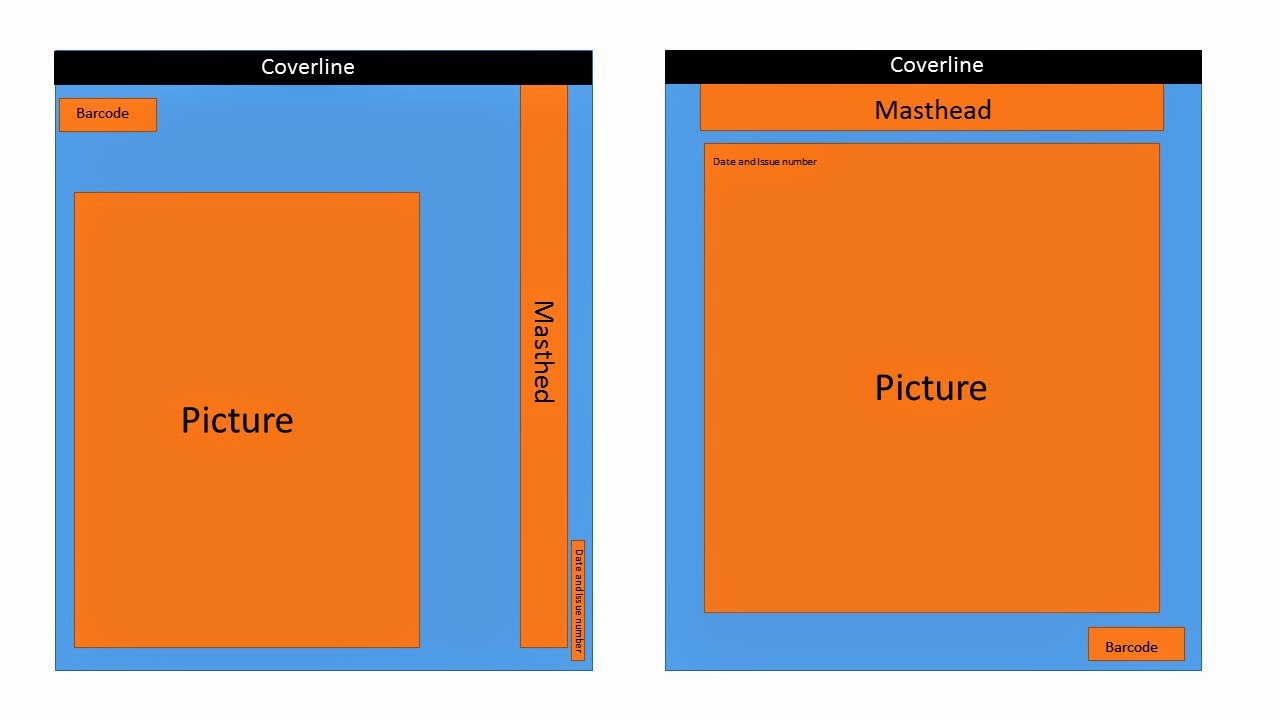
filled out my questionnaire said the masthead, by receiving this information I
made sure that my masthead was big and clear in order for it to stand out.
Over the period of completing both tasks, I have learnt
about the layout of magazines, I have learnt how to use Photoshop sufficiently
by learning this I learnt the importance of photography and editing in order to
produce the wanted product that appeals to my target audience.
Another thing I have learnt is how important research
and planning is when creating a magazine; I have learnt this through designing
flat packs and producing a questionnaire. By being aware of these aspects in
creating a magazine they helped me to have clear ideas on how to finish tasks
in a better quality and in a shorter period of time.
Lastly, I have learnt the progression of media
institutions through conducting research into different media institutions in
order to know what media institution would be best to market and distribute my
magazine and the conventions I should follow when producing my magazine.
Friday, 24 April 2015
School Magazine- Evaluation
My finalised school magazine, ‘Latest At Oasis’ shows
the vital conventions that all school magazines should have. As a masthead are
the magazine logo, it has a huge impact on sales as a result of this I insured
my masthead was bold and noticeable, by doing this I met the conventions of a
school magazine. My main image was a close-up shot of a female; I edited the
picture using Photoshop, I used Photoshop so that I could remove any flaws in
order to make my main image look professional. My aim for doing this was to
make my front cover eye-catching. I got feedback from both my teacher and
peers; I listened to all the feedback and acted accordingly. As a result of
this it showed me different features and techniques I could use to draw people
in.
By looking at other school magazines, I copied the media
conventions shown such as images, layout, font and content. My magazine is
similar to other school magazines as my images was placed in the centre of the
front cover and was surrounded by selling and cover lines as well as puffs. By
following these conventions of a school magazine it hugely helps getting the consumers
attention.
My media product represents particular social groups as
my magazine’s target audience is 12-16 year olds of both genders. Due to the
target audience my school magazine consists of articles that students can
relate too. In order to interest my readers my school magazine also contains
quizzes and games. By the information I have gotten from my questionnaire, I analysed
my results and acted accordingly. As Oasis has young footballers who play for
Crystal Palace a potential image for my school magazine was a palace player
warming up as it will attract students who are interested in football.
Bauer, it might distribute my media product as it has
over 300 magazines in 15 countries. Also because the brands that Bauer
institute have a wide range of target audience, as well as having online, TV
and radio stations.
Another reason as to why I’m using Bauer is because it’s
a paid circulation which means that the magazine is sold to readers for a
price, either on a per-issue basis or by subscription, where an annual fee or
monthly price is paid and issues are sent by post to readers. As a result of
this my magazine will make me a profit which will allow me to continue my
magazine.
Bauer media joined Bauer media group (Europe’s largest
private publishing group) in 2008 and the group employees 64,000 people and has
a 2008 turnover of 2.08 billion euros. Bauer media has a span of over 80
influential brand names, which cover a diverse range of interests. Their most
successful brand names are ‘Heat’, ‘Match’, ‘4music’, ‘Kerrang!’ and ‘CAR’.
Bauer
Consumer Media in the United Kingdom publishes ‘Kerrang!’ which is
a rock/ metal music magazine. The name of the magazine is onomatopoeic and refers to the sound made by an electric
guitar when playing a power chord. The audience (target group) for ‘Kerrang!’
is individually minded, independent of thought and musically experienced, an
audience defined by attitude, passion and loyalty. There are many Platforms
that ‘Kerrang!’ operate on, such as: magazine, radio, and TV, Website and
‘Kerrang!’ awards.
Media language is the multiple ways in which the media
communicates with their audience. There are 5 different types of media
communication approaches; visual, written, verbal, aural and non-verbal. My
front cover and content page both contain media languages; I have contained
media languages by the camera angles and shots I used. On my front cover, my
main image is a medium close up of a smartly dressed school girl. I did this so
that my main image represented what my school magazine is about without having
to look at the masthead or cover lines.
Whilst designing my school magazine, I have learnt and
development many skills in Photoshop. The skills I have learnt and developed in
Photoshop are how to abolish any flaws, to use liquefy and how to alter
backgrounds as well as learning how to add layers and change the brightness and
contrast of an image. During my preliminary task I gained the knowledge on how
to create a front page and content page, make questionnaires and also how to
make an effective plan and follow the plan in order to create a school
magazine. Through knowing my target audience before creating my magazine I knew
the kind of magazine I had to create in order to attract my target audience. I
acted accordingly to the target audience I was trying to attract by the colour
scheme I chose and the pictures.
Thursday, 23 April 2015


Tuesday, 21 April 2015


Thursday, 16 April 2015

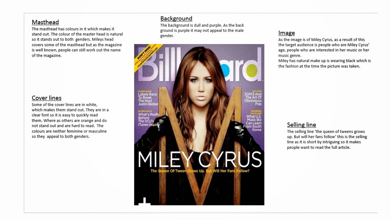
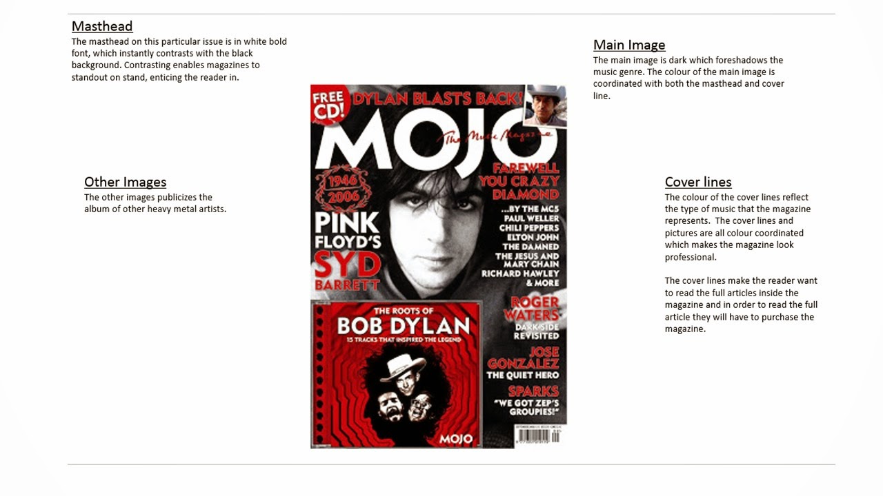
Music Magazine- Inspirations
Before I began constructing my music magazine, I researched popular
magazines to gather the styles and concepts of established music magazines. As
a result of doing this, I knew how my magazine should look as well as knowing
what kind of conventions were suitable for my magazine based on the genre I
chose.
These magazines inspired me because:

Front Cover- The three
front covers all inspired me in multiple different ways.

Content Page- I have been
inspired by these three content pages through them using a large image of a
celebrity that takes up majority of the page. Also I liked the boldness and
large font of the word ‘contents’ as it is clear and looks professional.

Double Page Spread- On the
double page spreads I liked that the image was large and took up a whole page,
as this shows the importance of the artist and also shows who the accompanying text
around the picture is about. Through the image being so large it informs the audience
on who the article is about, this can improve sales as people may just buy the
magazine to read about that specific artist. Also the way that the double page
spreads were constructed made the magazine look well organised and professional.


Music Magazine- Questionnaire Results


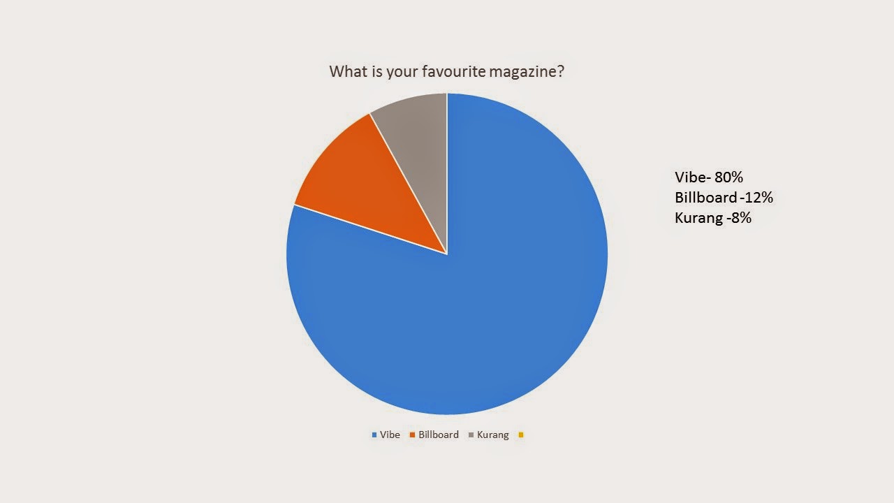
As the highest percentage for the favourite music genre was R&B, I have decided to produce a music magazine as it will have a large target audience which will help to make my music magazine a success.


Friday, 13 February 2015


Subscribe to:
Posts (Atom)